Create a Slide

Any App State user can create and share appropriate university-wide messages with campus — news, events, deadlines, accolades and more. Having a Scala screen is not required.

The information below will help you plan and refine your message and create effective digital signage content.

What's the Message?

Slide Design Standards

Visit the University Communications website for information on branding, logos, colors, fonts, and stock photos that can be used in slides.

Communications Planning

Start here! Digital signage should be part of your multi-channel communications plan.

A communications plan is a document that describes how you are going to communicate the right messages to the right people at the right time.

Consider these questions when creating your communications plan: 

  1. Who is your target audience(s)?
  2. What information do you need to share?
  3. What is your goal(s)?
  4. What action(s) do you want the audience to take?

Review the University Communications’ communication planning page for more information.

Typically, digital signage should not be the sole source of information distribution. The information should exist elsewhere on your website.

Creating Content

Once you’ve drafted a communications plan and identified your audience(s) and goal(s), it’s time to think about your message. 

What information do you want to share? What action(s) do you want the audience to take? 

There are many types of informational slides that you might create to promote your area or organization. Suggested types of content include:

  • Campus news and events
  • Campus services
  • Calls for nominations/applications
  • Honors and accolades
  • Upcoming deadlines
  • New programs or services
  • Course announcements
  • Schedule changes
  • Volunteer opportunities

Well-designed, concise messages are critical. The average attention span of your audience(s) is 7 seconds — which translates into 23 words or less.

Refine the Message

Ask: What is the most critical information that I need to share? When in doubt, leave it out!

Use these guiding questions to think about what details need to be included on your slide:

  1. WHO? Is there a speaker or presenter?  A sponsoring club, department or organization?
  2. WHAT? For example, is the slide advertising an event or a deadline? Are tickets being sold? Is registration required?
  3. WHEN? Is there a date and/or time to include?
  4. WHERE? Is there a location to include? 
  5. WHY it matters? What do you want the audience to know or do?

What to Include:

  1. Identify the sponsoring campus area or club — this can be text or an approved titlemark
  2. Identify the audience — is the slide for all students, a specific group of students, faculty, staff
  3. Date/deadline
  4. Time
  5. Location — Boone campus, Hickory campus, online
  6. Call to action 
  7. Accessibility statement (on event slides)
  8. Link for more information
    1. Website link — can be paired with a QR code
    2. Contact email 
    3. If the slide is promoting an Engage event, these statements are acceptable: Find us on Engage OR RSVP on Engage

Accessibility Statement

If your event is open to all — with no advance registration or tickets required — include the university’s accessibility statement on the slide:

For a disability accommodation, visit odr.appstate.edu.


Link for More Information

Typically, all slides should include a link for more information.

One of these is required:

  1. Website link — can be paired with a QR code (see below)
  2. Contact email 
  3. If the slide promotes an Engage event, one of these statements is acceptable: Find us on Engage OR RSVP on Engage.

Keep links simple and clean. Do not include "https" or "www"— for example: digitalsignage.appstate.edu. 


QR Codes on Digital Signage

QR codes can be used in digital signage but may be difficult for users to scan:

  • QR codes should be large and have good contrast.
  • Use a short URL for the QR code for better scannability.
  • Must be paired with the website link, contact email or Engage statement for accessibility.


Example

In this example, a QR code is paired with a website link. The QR code points directly to the referenced article; the website link points to the main site. 
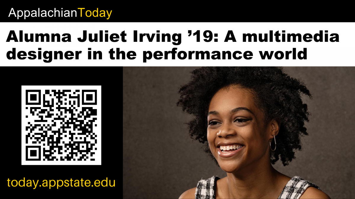
Slide example showing a QR code paired with a website

Design Your Slide

Once you've finalized your message, it's time to design your slide. 

It's important to select fonts, colors, graphics and a layout that engages the audience while considering readability and accessibility.

Ready to design? The following programs are recommended for content creation: 

Review the below slide design standards before you begin. 

Acceptable File Formats

Scala CMS supports the following formats for uploads: 

  • Images (jpeg, png or gif)

  • Videos (mp4)

Scala CMS does not support PDFs, PowerPoint presentations or Google Slides.


Videos and/or Animated Slides

  • Animated slides (10-15 seconds or less) and short videos (30 seconds or less) are appropriate for digital signage.

Because most campus players are not audio-enabled, videos should not rely on sound to convey the message. Instead, try combining images with captions or text.

Size and Orientation

Your slide should fit a standard television screen.

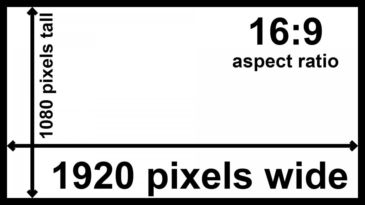
The minimum pixel dimensions and orientation are: 

  • 1920 x 1080 pixels
  • Landscape/widescreen (16:9 aspect ratio)

1920px x 1080px / 16:9 aspect ratio

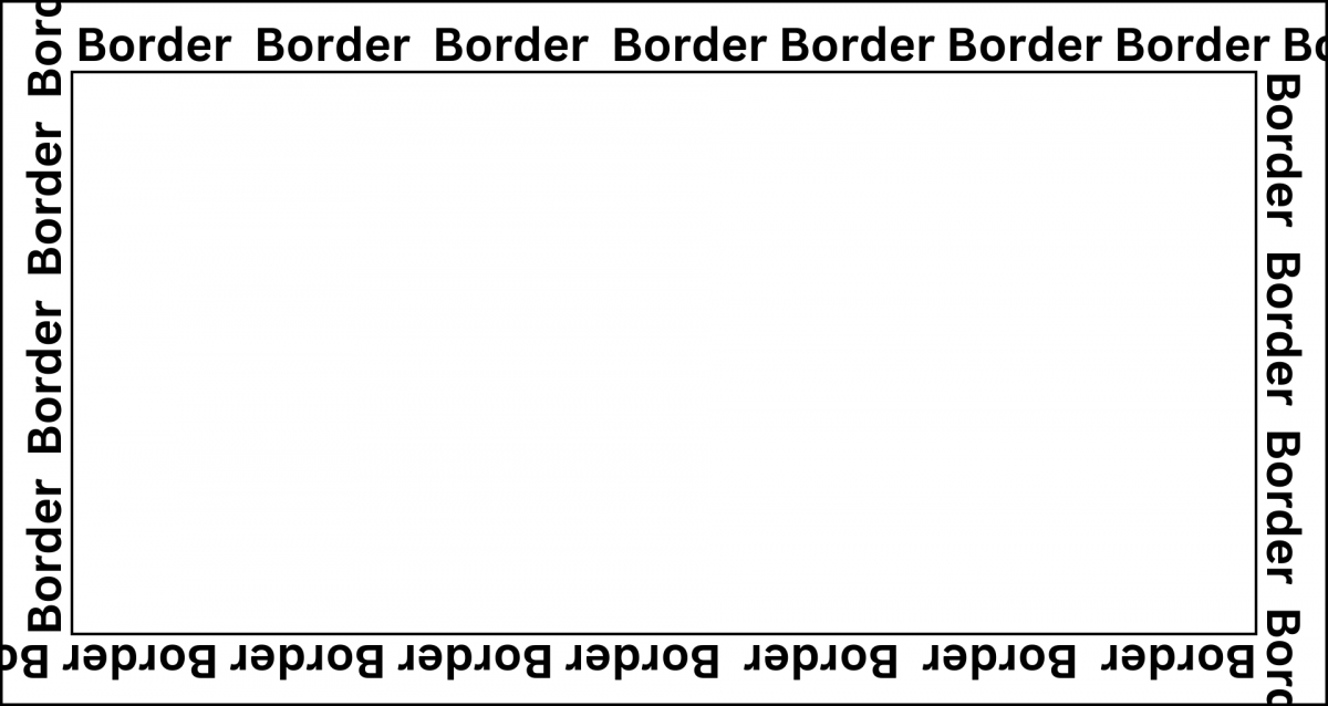
Leave a border (padding) or "safe area" around the inside of the slide to ensure text/graphics are not cut off. 

Sample slide showing a border

Fonts and Readability

Your message matters — consider how it will be presented. Choosing the right font and font style can make or break your signage!

Choosing a Font

  • Use large font sizes:  
    • 100+ point text suggested for headings — readable from 25 feet away by someone with normal eyesight.
    • Avoid anything smaller than 35-point text — readable from seven feet away by someone with normal eyesight.
  • Use standard sans serif fonts and limit to two fonts:
    • Standard sans serif fonts include Arial, Avant Garde, Geneva, and Helvetica.
    • Avoid fancy or gothic fonts.
    • Stick to the basics — some fonts may not render properly on all players.

Readability

  • Keep text simple and minimal:
    • Format with titles, highlights or bullets.
    • Avoid paragraphs!
  • Use sentence structure: 
    • Reserve ALL CAPS or bold for text you want to call extra attention to.
    • Ensure adequate spacing between each element and between letters.
      • For example: 10 to 35% of stroke for letter spacing; 35-70% of letter height for line spacing.

Use the 3x5 rule: Limit the message to three (3) lines of text with a maximum of five (5) words per line or vice versa.

Example of slide using the 3x5 rule with three lines of text with five words each

Example of slide using the 3x5 rule with five lines of text with three words each

Read Adobe Express The Best Logo Fonts and How to Choose Your Own blog post to learn more. 

Color

Color can convey mood, provide contrast, aid readability and grab the audience’s attention. 

Everyone connects with color and perceives color differently. How does red make you feel? How about blue? 

Selecting a Color Palette

A color palette can aid your design — but it’s important to keep the palette harmonious and limited.

A good place to start is with App State's color palette which focuses on black and gold along with several other color options. 

Learn more about color palettes and create your own:


Design for Color Blindness

Red/green color blindness is the most common, so avoid green on red or red on green.

Other problematic color combinations are: 

  • Blue and yellow
  • Green and brown
  • Blue and purple
  • Green and blue 
  • Light green and yellow
  • Blue and grey
  • Green and grey
  • Green and black

Color Contrast

Insufficient contrast between text color and background color can make reading difficult.

  • Black and white is the most readable combination.
  • Use dark font colors on light backgrounds and vice versa.
  • Avoid extremely bright colors as background colors.

Sample slide with good contrast - black with gold text

Sample slide with poor contrast - white with gold text

When in doubt, check your color contrast ratios on WebAIM.

Images, Graphic Elements and Backgrounds

Images, graphic elements and backgrounds should complement your message. Don't add too much — less is more!

  • Use hi-res, relevant images (that you have permission to use!). 
  • If using an image as a background, consider if the message text is readable.  You may need to use a text overlay (opaque or semi-transparent backing box) to make text more readable over backgrounds. 

University Communications maintains a database of stock photos — campus events, campus life, scenic views of campus and more — that can be used in slides.

Contrast

Contrast — the visual difference in elements of your design — will help organize your design.  

  • Contrast in size adds visual interest to your composition. 
  • Contrast in shape helps elements stand out
  • Contrast in color prevents elements from competing with each other.


Examples

In these examples, the slide on the left, while readable, has no size, shape or color contrast; whereas, the slide on the right incorporates different font sizes and weights, colors, hierarchy and alignment. 

Example of two slides demonstrating contrast - left side shows a series of words all the same size and color, right side shows the same words in different font sizes, weights, colors with different alignment.

Composition

Composition is how all of your design elements work together. A good composition should attract the viewer’s eye and guide it around. 

The design program you choose will have margins and grids to help with the layout. Use these margins to leave a border (padding) or "safe area" around the inside of the slide to ensure text/graphics are not cut off.

Rule of thirds

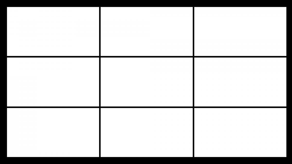
  • The rule of thirds breaks an image or composition down into thirds — both horizontally and vertically — so you have nine pieces and four gridlines. 
  • By positioning key elements along the gridlines, you’ll end up with better compositions. 

rule of thirds example


Organize content by hierarchy

  • The most critical text and/or image should be the largest.
  • Generally, design top-down — most critical to least critical, largest to smallest.


Example

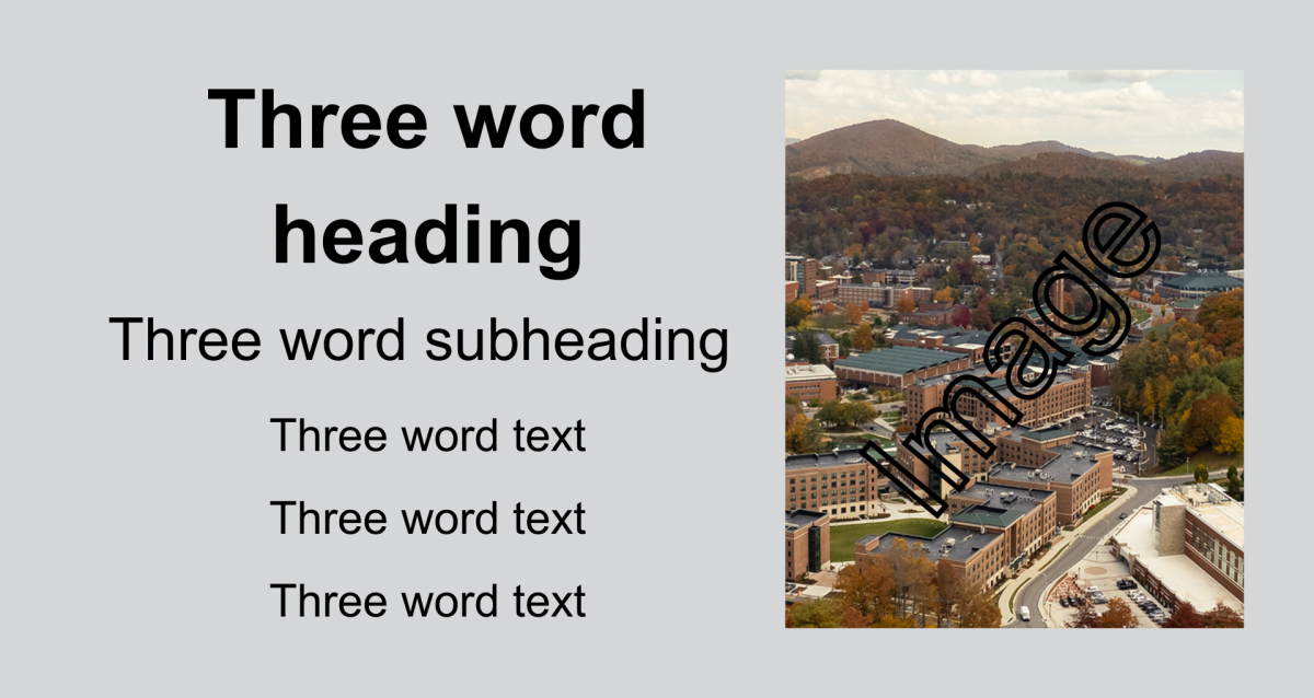
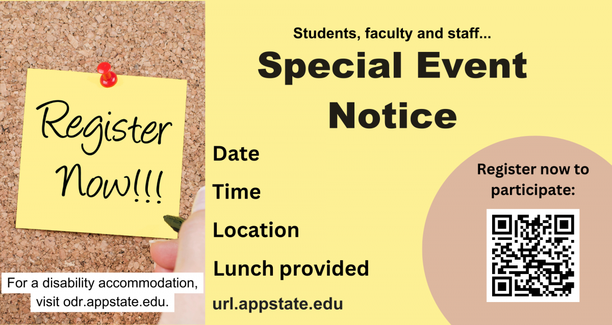
In this example, the title is the largest text and the most critical piece of information. The other text fields are of similar size and therefore, importance. A complementary image and QR code for registration is also included. 

Example of slide demonstrating text heirarchy - top to bottom, largest to smallest.

Read Adobe Express Demystifying graphic design with 10 tips for non-designers blog post to learn more about composition and graphic design.

Design for Accessibility Checklist

Before you submit your slide to be shared campuswide, review it for accessibility. 

Visit App State’s Accessibility webpage for general accessibility guidelines relating to creating accessible content. The information below serves as a final checklist when reviewing your content. 

To comply with ADA standards, anyone creating slides is responsible for meeting these standards:

  • Digital signage should not be the sole source of information distribution. The information should exist elsewhere on your website.
  • Does your slide promote an event that is open to the all? Remember to include the university’s accessibility statement: For a disability accommodation, visit odr.appstate.edu.
  • Keep font sizes large. 100-point text is readable from 25 feet; 35-point text is readable from seven feet.
  • Use sans-serif fonts.
  • Ensure adequate spacing between each element and between letters.
  • Design for color blindness: Avoid red/green and other problematic combinations.
  • Use text colors that have high contrast with the background color.

Visit Getting Started to view Appalachian's mounting accessibility guidelines. 

Now that you've created content, reviewed it for accessibility, and downloaded it as an image or video file, submit it to be shared campuswide. You'll also find example slides from across campus on this page.